Empty Book Redux
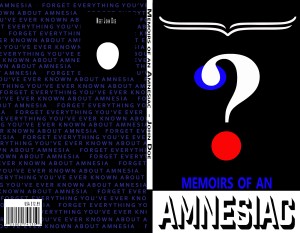
I think it was the second project this semester? And one that should have been right up my alley. But I still remember the pain of seeing my less than stellar grade on the above design and facing the hard cold fact that it was not a fluke. “A great concept here, but design elements need much more time and attention. Would need significant work before it was ready for your portfolio. Use of smashed and squashed type throughout would be a portfolio closer for many people”
I met with my instructor about 2/3 of the way through the semester to discuss a number of things of much greater importance than this project, but I seriously wanted to know – for my own edification and growth – what was so wrong with it? Shoulda known better… if you don’t want the truth, don’t ask for the truth. Don’t get me wrong. I knew this was far from my best work, I wasn’t defending it, or attempting to explain my poor choices. I just really couldn’t put my finger on the specific problem, other than the typography issue.
He sort of tried to be diplomatic about his response to my question, but eventually he had to come right out and say that he thought the design was just bad. He challenged me – would my book stand out on a shelf? And he criticized the thin lines I used for the head shape. At least now I knew some of the specific weaknesses of the design. I can usually identify when my work isn’t up to par, but I’m still a student and I cant always tell what the actual fatal flaws are.
So on top of designing the empty book, we had to actually get it printed as well. We had til the end of the semester to upload it to lulu.com, get it back and submit a picture of the final physical product. And that felt like a second chance to me. But like most second chances, I didn’t reach out and take it right away. there was television to watch and sleeping in to do and so many glorious forms of procrastination to explore and indulge in. But I got a fairly brusque group email from my instructor last week informing me (and my fellow procrastinators) that we had not yet sent him visual proof of our produced book. So I spent a day thinking and rethinking my design.
I didn’t want to scrap the whole idea. Even though I had generated a number of directions I could go in my original sketches, some of which were much more interesting to me, I wanted to prove that I could save this failed design. I started with the back cover – I chose one quote to highlight and I really thought that repeating that line at jagged intervals in electric blue on a black ground had some visual promise. Enough visual promise that I changed my front cover to the same background. I tried it with and without the text, but ultimately determined it was better with. I struggled with the face shape. In my mind, I wanted there to be a soft void where the head existed – no clear lines delineating it like they did in my original submission. I played around with opacities and feathering, even doing away with the shape entirely to no avail. It wasn’t different enough.
It wasn’t until I chopped half of the head off that I began to see a ray of hope. I decided to highlight the word forget in my repeated sentences in order to underscore its importance. I even moved the line under the eye so that the word forget became the visual center of the composition and re-shaped the eye. I felt like I was getting there. I pulled my parallel parentheses from the top down to the bottom of the cover. Now, instead of being hair, or eyebrows, or the bottom half of a speech bubble, they became pages in a book, tying directly to the title word memoirs that was placed immediately below that element. Still wasn’t completely grabbing me. But when I changed the word Amnesiac to the electric blue, pulled that color into the spine ultimately leaving just a single pop of red and a single curl of white in the question mark, THEN I started to feel the vibe. I decided to leave the back cover with just the black ground and blue text and forego any barcodes or author pictures. I sent it up to Lulu. I think its better. I don’t know if its enough better enough to be a portfolio piece, but I DO think it would stand out on a shelf.


Recent Comments